My honours project: Naya
A mobile app focusing on helping users maintain a meaningful connection in their relationship through unique communication methods.
Role
UX/UI Designer
Industry
Lifestyle
Industry
Lifestyle
Duration
8 months
Stage 1. Brief
As this was my 4th year honours project, I was responsible for creating my own brief. I really enjoyed this freedom, as it was the first time I could design something entirely of my choosing. The brief was inspired by my girlfriend - I wanted to design a mobile app and physical product that helped couples maintain a meaningful connection through unique communication methods. The idea stemmed from a personal desire to express how I was feeling without always needing to put it into words.
Stage 2. User Research
Once I had defined my brief, I engaged with over 30 students through online surveys and interviews to gather meaningful insights into how they navigate their relationships and what they value in maintaining a strong connection. This research phase highlighted the importance of communication and revealed that, when prompted, people often have heartfelt and thoughtful things to share about their partners. These insights led the project in a direction I hadn’t initially anticipated, placing a focus on both long-form communication and shorter, everyday expressions of connection.
Stage 3. Idea Generation
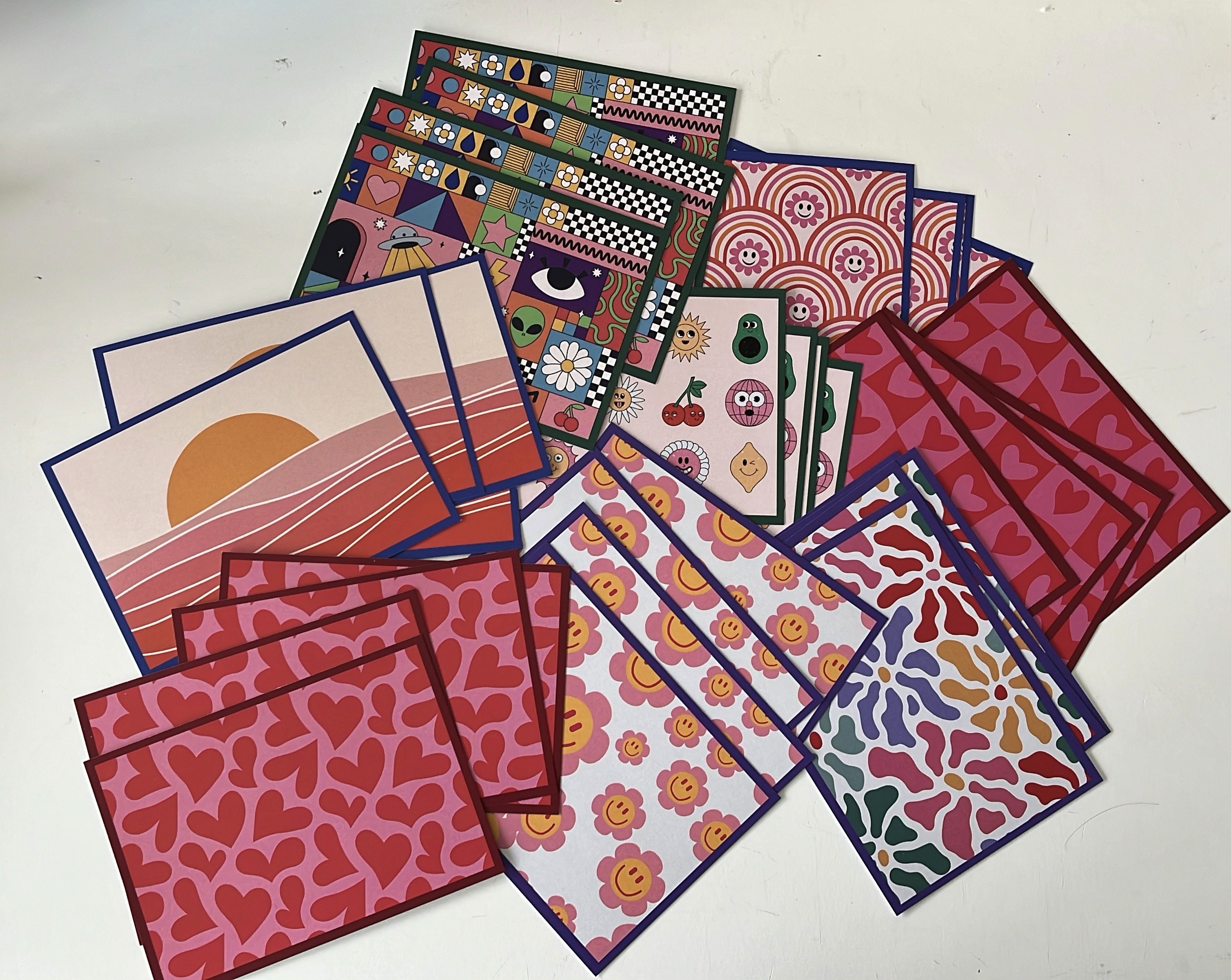
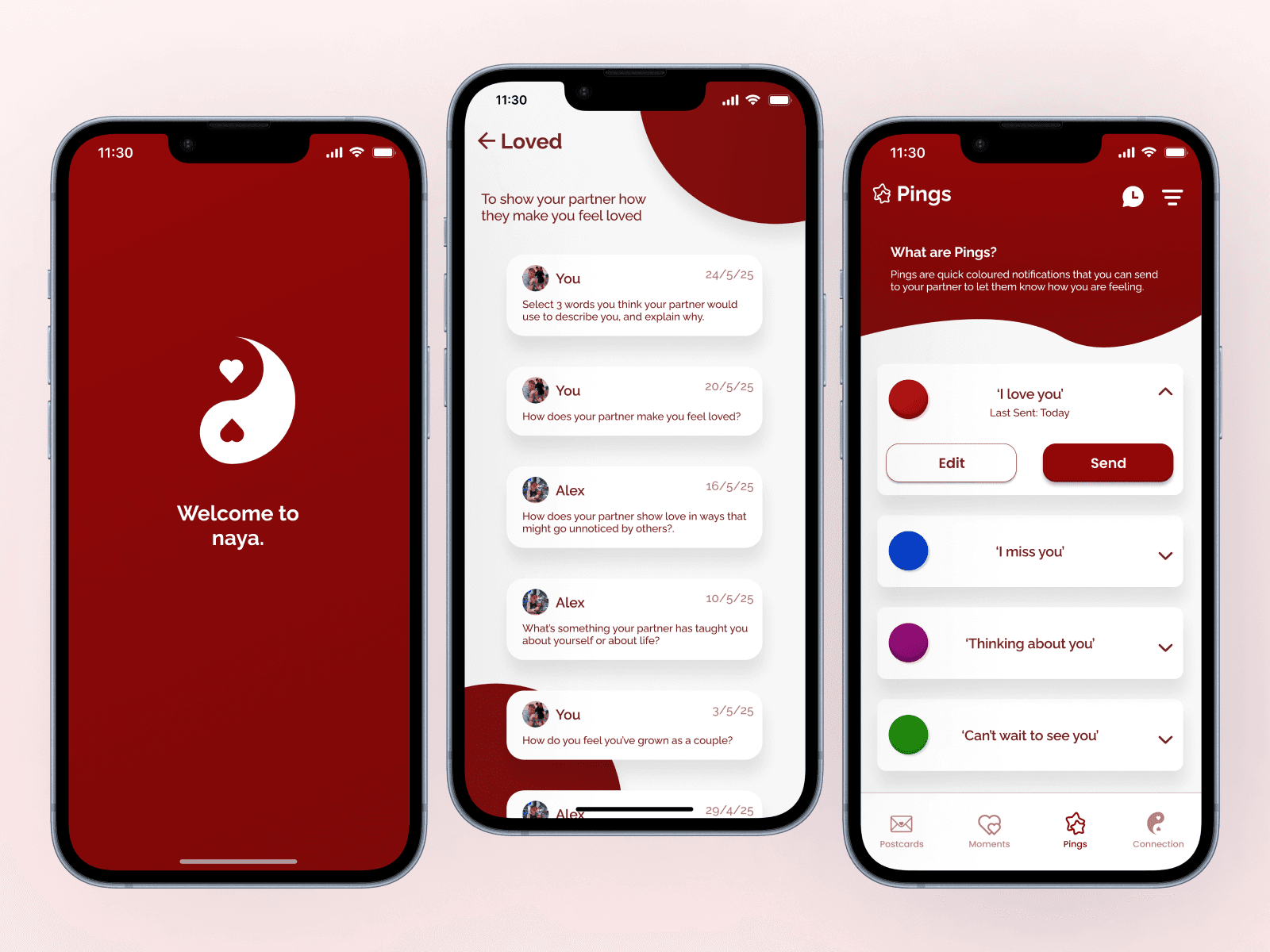
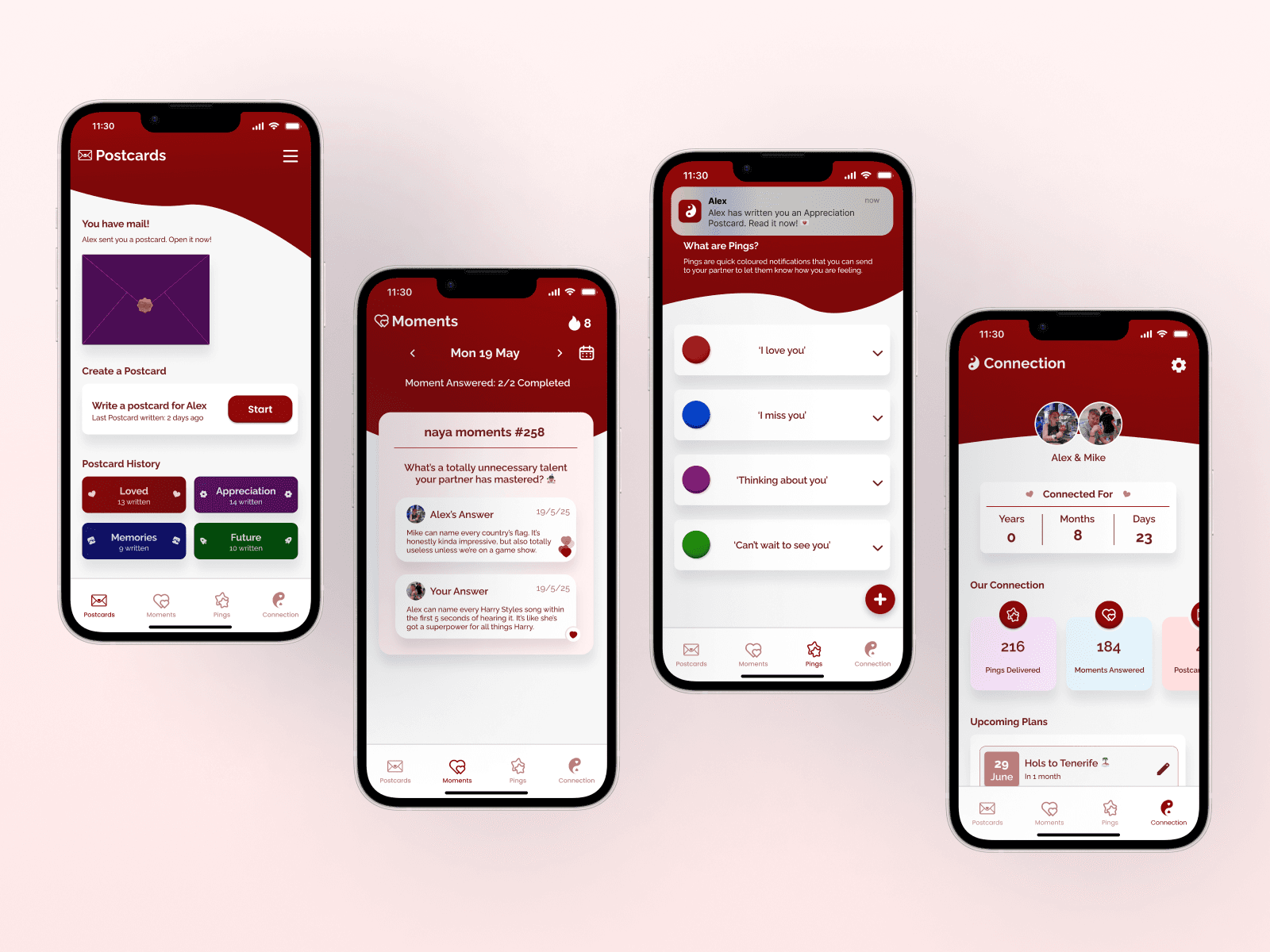
To begin the design process, I brainstormed the essential elements of the project - starting with a short-form communication system using colour-coded messages, where each colour carried a specific meaning that could be easily understood by the partner. Alongside this, I designed physical postcards with tailored prompts written by me, encouraging users to write more meaningful, heartfelt responses, intended to be used less frequently than the colour-based messages. I intended to design the app to support and enhance these two forms of communication, creating meaningful interactions that felt enjoyable and thoughtful for both the sender and the receiver. To create the postcard prompts, I utilised AI to generate over 100 unique ideas, which I then carefully sorted into four meaningful categories: Loved, Appreciation, Memories, and Future. After sorting the postcards into categories, I designed a distinct visual identity for each one, using colour schemes and themed visuals to clearly differentiate them.
Stage 1. Brief
As this was my 4th year honours project, I was responsible for creating my own brief. I really enjoyed this freedom, as it was the first time I could design something entirely of my choosing. The brief was inspired by my girlfriend - I wanted to design a mobile app and physical product that helped couples maintain a meaningful connection through unique communication methods. The idea stemmed from a personal desire to express how I was feeling without always needing to put it into words.
Stage 2. User Research
Once I had defined my brief, I engaged with over 30 students through online surveys and interviews to gather meaningful insights into how they navigate their relationships and what they value in maintaining a strong connection. This research phase highlighted the importance of communication and revealed that, when prompted, people often have heartfelt and thoughtful things to share about their partners. These insights led the project in a direction I hadn’t initially anticipated, placing a focus on both long-form communication and shorter, everyday expressions of connection.
Stage 3. Idea Generation
To begin the design process, I brainstormed the essential elements of the project - starting with a short-form communication system using colour-coded messages, where each colour carried a specific meaning that could be easily understood by the partner. Alongside this, I designed physical postcards with tailored prompts written by me, encouraging users to write more meaningful, heartfelt responses, intended to be used less frequently than the colour-based messages. I intended to design the app to support and enhance these two forms of communication, creating meaningful interactions that felt enjoyable and thoughtful for both the sender and the receiver. To create the postcard prompts, I utilised AI to generate over 100 unique ideas, which I then carefully sorted into four meaningful categories: Loved, Appreciation, Memories, and Future. After sorting the postcards into categories, I designed a distinct visual identity for each one, using colour schemes and themed visuals to clearly differentiate them.
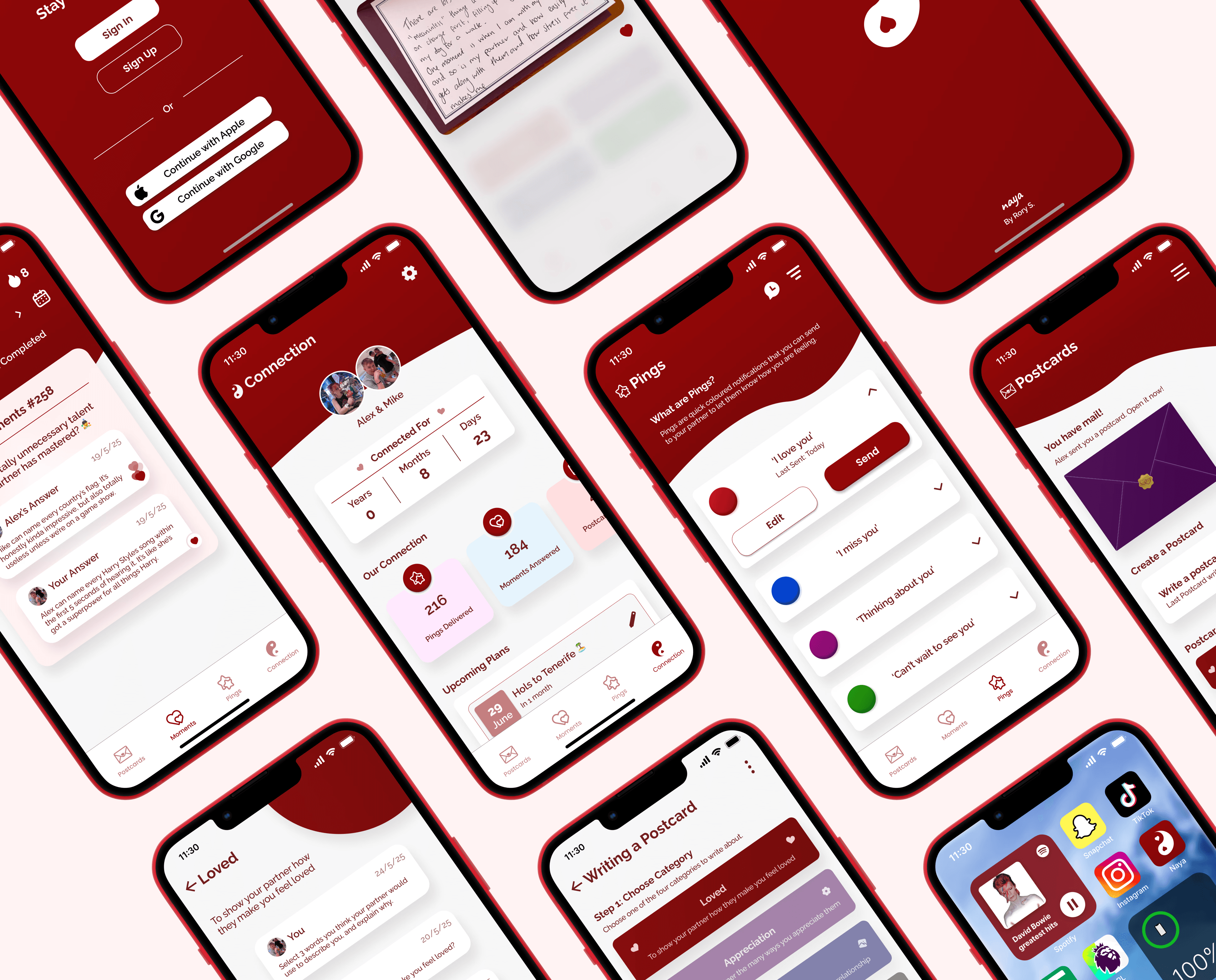
Stage 4. UI/UX Design
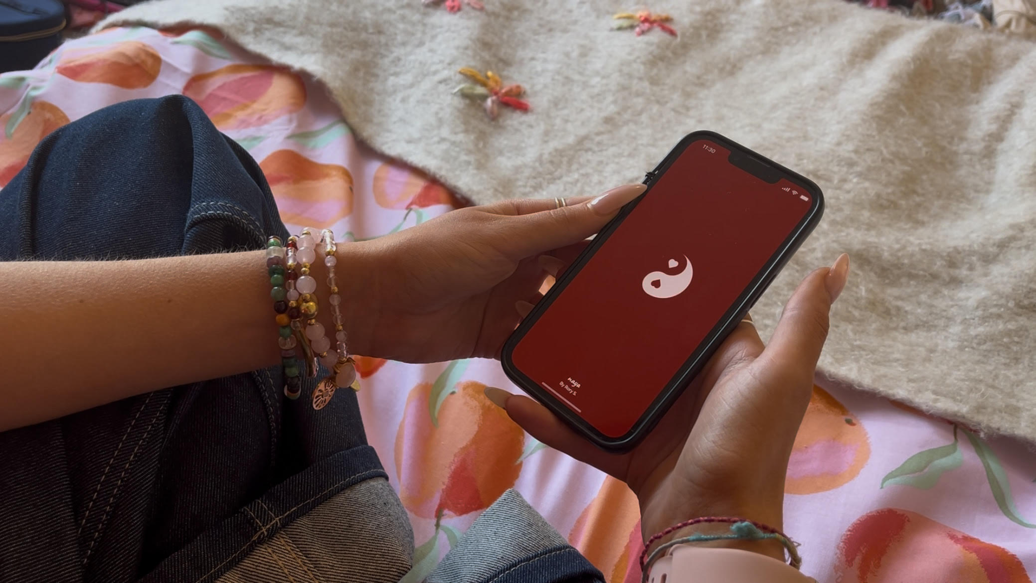
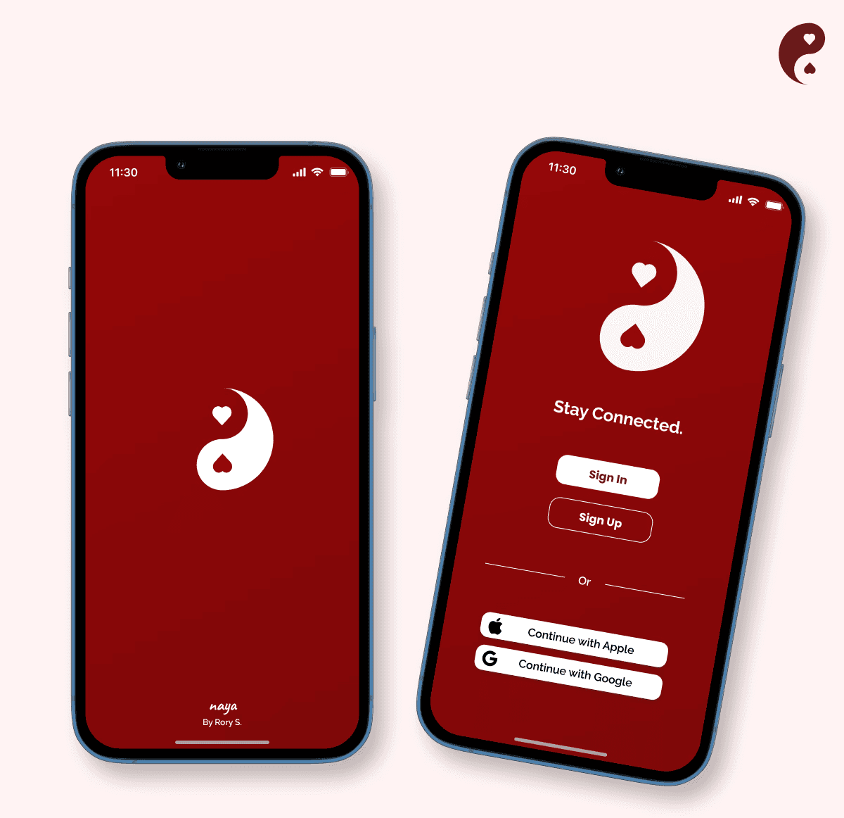
After finalising the physical design, I shifted focus to the app. I developed a visual identity that aligned with the project’s ethos, including a red colour palette to symbolise love and emotional connection. This stage involved numerous iterations, testing different designs and interactions to ensure a seamless user experience. The interface was designed to be fun, intuitive, and easy to navigate. A full working prototype was created in Figma, ready to be showcased at my degree show.
Stage 5. User Testing & Feedback
To test my near-final prototype, I organized a series of user testing sessions with both interactive designers and intended users to evaluate the app's user experience and aesthetics. I asked users to complete specific tasks and provide feedback on how the app felt and looked. This feedback was invaluable, leading to multiple design iterations and improvements based on their constructive input.
Final Outcome
Naya is a polished Figma prototype and physical postcard design, created to help users maintain meaningful connections in their relationships. Starting from a self-written brief, the project challenged me to apply and grow my UI/UX skills while deepening my understanding of meaningful user experiences. It’s been my favourite project to date, and I’m excited to keep pushing my design abilities in future work.
Stage 4. UI/UX Design
After finalising the physical design, I shifted focus to the app. I developed a visual identity that aligned with the project’s ethos, including a red colour palette to symbolise love and emotional connection. This stage involved numerous iterations, testing different designs and interactions to ensure a seamless user experience. The interface was designed to be fun, intuitive, and easy to navigate. A full working prototype was created in Figma, ready to be showcased at my degree show.
Stage 5. User Testing & Feedback
To test my near-final prototype, I organized a series of user testing sessions with both interactive designers and intended users to evaluate the app's user experience and aesthetics. I asked users to complete specific tasks and provide feedback on how the app felt and looked. This feedback was invaluable, leading to multiple design iterations and improvements based on their constructive input.